Embers Design System
Summary
When I joined the Promethean team we had UX designers who not only were not sharing files and collaborating, they were not even using the same design tools. I led the charge to get everyone aligned on a single design tool and file sharing with some shared common assets. But when we were faced with a rebrand in late 2021, we took the big leap forward to a full-fledged design system. And thus "Embers" was born.
Company
Promethean World
Role
Lead Designer
Timeline
2021-2024
WHAT
Commonly used colors, UI, and patterns for web properties
WHERE
Design tools (Figma) & Embers front end design library
WHO
UX designers and front end developers
WHY
To gain continuity across our products and prevent duplicate work
Rebrand
We had colors and a style guide (few shared components), previously used for a few projects, but we were embarking on a company rebrand and were getting all new direction from marketing. It seemed like an ideal time to set up a proper design system and formalize everything as we went. The goal was to not only create a library of shared components in Figma to be used across the team, but for the developers to also build out those components as reusable and configurable elements that could be reused in the code across all projects and reduce the need to recode common elements every time a new feature was needed.

Team Roles

We had a two designers and not enough sense to know how big a project this would be. Our project managers and developers had to be convinced that the time and effort needed to build a full design system would be worth it in the end and should be prioritized with more immediate needs.
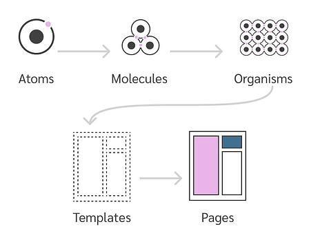
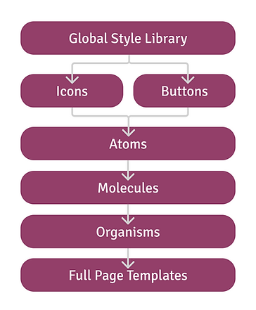
Atomic Design
We chose to adopt the atomic design philosophy and started with atoms, or smallest piece of UI and then worked up to molecules and organisms. We initially thought this would all be a single library file, but Figma had other plans for us and we quickly realized the file getting too big and having memory issues, so we ended up dividing the library into multiple files.
Asset Audit

We collected all assets across products and designers to make sure everything was accounted for and we wouldn’t be surprised by anything once we were too far into the process.
Material Design
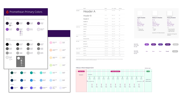
We had already been using Material Design as a basis for a lot of our controls so we decided to continue to use Material as a basis for Embers. Why deviate from best practices that users already expect? We made changes and added specifications where needed for our unique purposes.

Design Principles

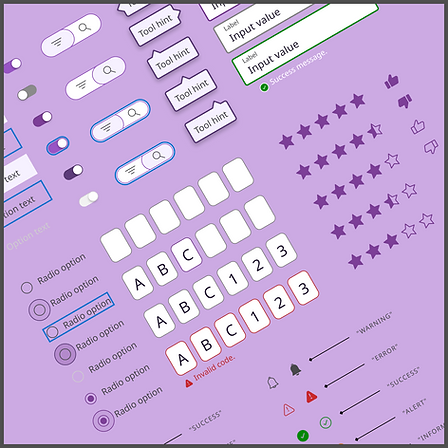
Sample Atom
Sample Molecule
Sample Organism
Sample Page Template
Accessibility
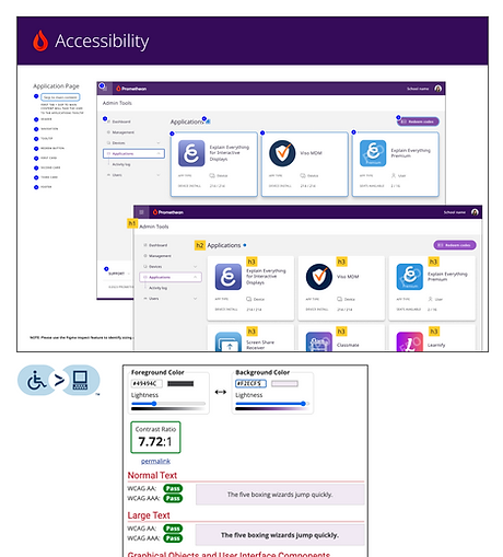
Worked with accessibility experts at Level Access to meet WCAG 2.1 standards and develop guidelines such as:
-
Color contrast must meet AA standards with ratio requirements:
-
Normal text - 4.5:1
-
Large text - 3:1
-
Graphical elements - 3:1
-
-
Elements must be distinguishable by more than just color
-
Alt text for all images (that are not decorative)
-
Define tab order and distinguishable focus states for all page elements for keyboard accessibility
-
Automated video looping limits
-
Minimum touchpoint sizes
-
Visible labels for inputs (rather than placeholder text)
Icon Library
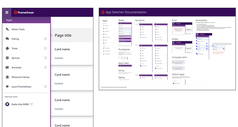
In order to reduce page load time, I created a custom icon font for our icon library. Generated with Icomoon, it consisted of over 1,000 icons.

Published Libraries
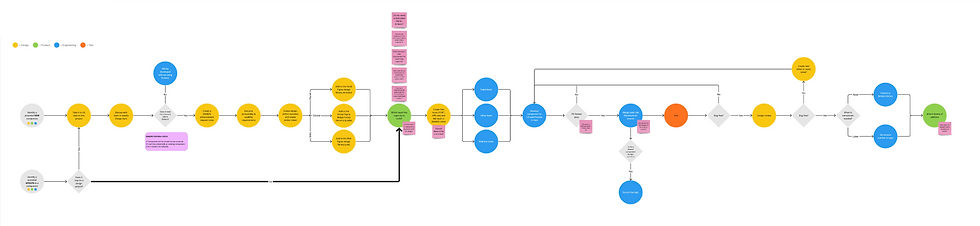
At the start we thought we could create a single published library file for our design systems. The limitations of Figma and the size of the project dictated it needed to be broken up into a number of different library files to prevent Figma bogging down. So this depicts how these files were broken up and how each fed into the others.
50% time savings! It's super helpful and so nice to have built in templates!
- Jennifer Sloan, Senior Software Engineer
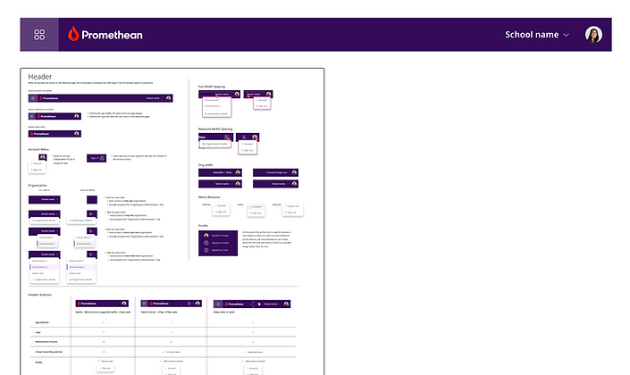
Documentation

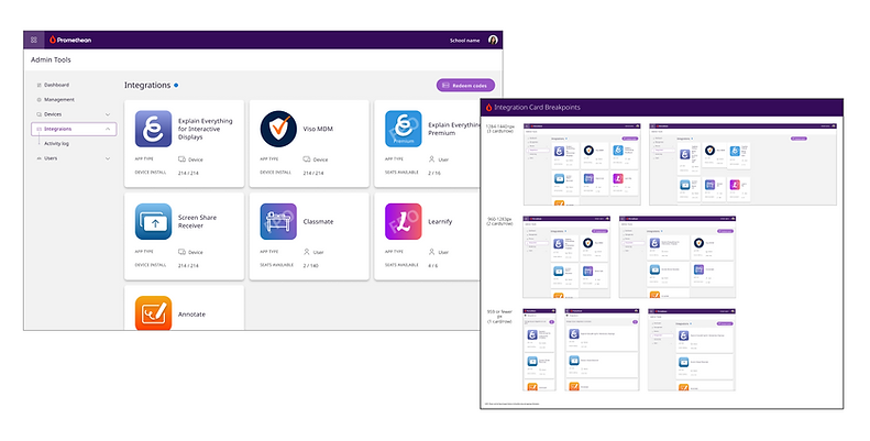
We created documentation on how to use the library and its components and checklists to run through before designs were complete. We also had an internal site where developers built out our components that we could reference and were we would QA new components or component enhancements. We also started the process to transition this to Storybook.
82% adoption across all product teams
New Components
We developed a process by which we could determine if a new UI element should be added to the design system. New components would be brought to our weekly UX meetings for discussion and evaluation. Usually the deciding factor was if it had the potential to be reused in other areas of the product.


